ACMI Shop
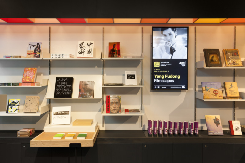
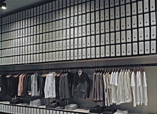
The store for ACMI at Federation Square was remodelled to provide a confident, new retail environment for the cultural institution.
More Information Less InformationThe brief called for a response to create flexible merchandising and address a number of commercial issues with the existing store including poor sightlines, access and circulation. There were two key aims of the project. Strategically: to address issues of poor visibility from the ticket desk and escalators, constrained circulation, and a tunnel-like proportion. The solution needed a confident presence within the strong personality of Federation Square and better flexibility for supporting major exhibitions. Culturally: to support the client’s aim of becoming Victoria’s premier retail destination for moving image books and DVDs.
By remodelling the entrance and adjacent store rooms, the design creates a proportion which is wider and shallower. This gives greater visibility to the product and eases circulation. The shop front was removed to allow access from two sides, with security provided by a transparent fabric at night.
The store is framed above by a black steel ribbon. Subtly analogous to a film strip, it defines the store and creates focus on the product below. This device extends to the entrance to provide a zone for signage, with the future capacity for further application. Behind this is a spectrum of chromatic boxes. These provide a subtle reference to the colours of visible light and assist in defining the product zones. Stained timber plinths and trays at low level frame a flexible merchandising zone.


