Interface
An exhibition which examines how design has been applied to information technology products.
More Information Less InformationTitled ‘Interface: People, Machines, Design’, the exhibition set out to understand the relationship between information technology, design and commerce. The core design approach stemmed from an understanding of the objects, based on principles which underpin the design of many of the objects within the exhibition: simplicity, order and rationality.
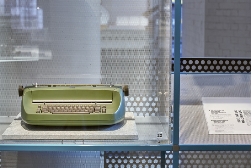
The history, context, materiality, coloration and size of each individual piece was considered, along with their relationship to the other pieces within the wider narrative of the exhibition. Variation in object density, scale, display heights and viewing angles were all used to ensure the objects were individually captivating and legible, and collectively informative and cohesive.
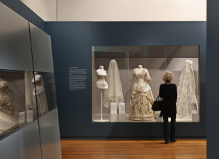
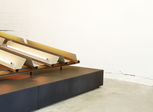
The spatial arrangement of the exhibition was a response to the three curatorial sections of the exhibition and the physical layout of the Gallery. The objects were displayed in one of two contexts; within a modular wall frame or on top of a large custom illuminated ‘table top’.
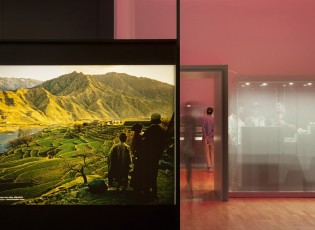
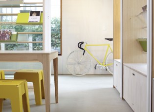
The open wall frame allowed the curation of objects into curatorial stories and also framed views out of the exhibition into the wider context of the Museum. The table top, set to the height of a domestic table, allowed visitors to view ‘household’ objects, typewriters, personal computers and printers in a familiar relationship to the user. The language of both of these display systems was simple, geometric and neutral, with an effortless approach to allow the objects to inhabit them without competition. Both elements were modular for future adaptation and re-use.
Many of the objects were layered onto base materials, which have a direct relationship to the context and qualities of the items. These materials were simple, subtle, recessive, tactile and, in response to the largely neutral object spectrum, chromatic. A series of polished acrylic plinths and cases continued this language to elevate, protect and carry labelling as required.
Considered integration of supporting information and audio visual content completed the design language to provide a personality that was informed, legible and unifying.


